Cloud architecture diagram generator
Turn Terraform, Kubernetes, or Docker Compose into an architecture diagram in seconds. ops0 detects regions, VPCs, availability zones, and subnets, draws them as nested boundaries, and flags the structural problems hiding inside — free, entirely in your browser, nothing uploaded.
The diagram generator needs a real screen and a keyboard to paste infrastructure code and read the architecture. Open this page on a desktop browser to use it.
100% in your browser. Nothing is uploaded. Open DevTools then Network and see for yourself.
Paste infrastructure code and hit Generate. Regions, VPCs, availability zones, and subnets are detected automatically and drawn as nested boundaries.
AWS three-tier input, diagram, and findings.
This synthetic sample includes a load balancer, application services, and a database. It deliberately includes public SSH access, an unencrypted public database, and disabled database backups so you can examine the findings. It is a visualization example, not a deployment template or a customer environment.
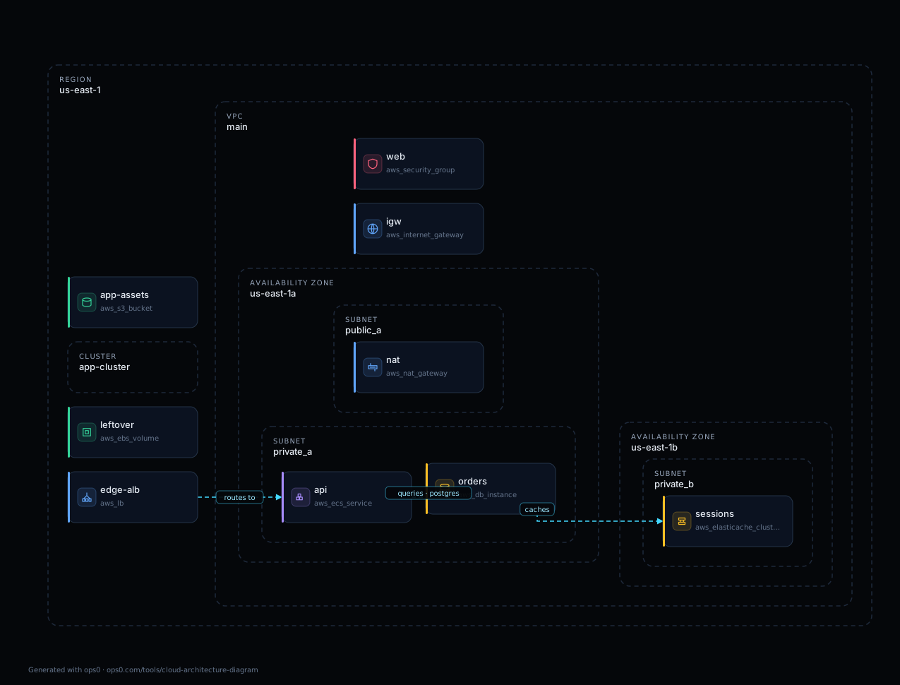
Use the AWS three-tier sample button in the generator above to try it yourself. Only resources represented by the supplied file can appear.
A cloud architecture diagram generator that understands the infrastructure.
Terraform HCL, `terraform show -json` plan and state, Kubernetes manifests, and Docker Compose are parsed into a resource graph with real dependencies, not hand-placed boxes.
Regions, VPCs and VNets, availability zones, subnets, clusters, namespaces, and Compose networks become nested containers, so the diagram reflects how the estate is actually structured.
Single-AZ databases, public database endpoints, security groups open to 0.0.0.0/0, overlapping CIDRs, missing NAT, absent WAF, and unattached volumes are detected as you paste.
Each result carries why it was raised, the risk it creates, the best practice that resolves it, and the impact of fixing it. Severity rolls up into an A to F architecture score.
Static Terraform cannot resolve every variable, module, count, or for_each. JSON provides resolved instances, but a diagram is still limited to the supplied snapshot and supported resources. Review parser notices and inferred connections.
SVG and 2× PNG for slides, Mermaid for GitHub and Notion, draw.io XML that opens with the layout intact, PlantUML for docs pipelines, and a plain text outline.
Generate a diagram from Terraform, Kubernetes, or Docker Compose
The format is detected automatically, so there is nothing to configure. Paste code or drop a file — everything is parsed locally in your browser.
Terraform diagram generator
Terraform · OpenTofu · HCLPaste Terraform or OpenTofu HCL and the generator parses every resource block, resolves references between them, and lays out VPCs, subnets, and availability zones as nested boundaries. Because raw HCL cannot resolve variables, modules, count, or for_each without a plan, the diagram is marked best-effort and tells you exactly what it could not resolve.
Diagram from Terraform state or plan
terraform show -jsonPaste terraform show -json output from your state or a saved plan to visualize resolved resource instances. This can capture more detail than raw HCL. It shows the supplied snapshot, not a live cloud scan: check state freshness, unsupported types, parser notices, and connections inferred by the tool.
Kubernetes architecture diagram
YAML · multi-document manifestsPaste one manifest or a whole multi-document YAML file. Deployments, StatefulSets, Services, and Ingress are grouped by namespace, and the edges are derived the way Kubernetes actually wires them: Service label selectors to workloads, Ingress backends to Services, and HorizontalPodAutoscalers to their scale targets.
Docker Compose diagram
docker-compose.ymlPaste a compose file and each service, network, and volume is drawn with the links between them — depends_on ordering, volume mounts, and network membership. Published ports and credential-shaped environment variables are flagged as findings.
Choose the diagram workflow that fits your source.
A manually maintained drawing is useful for proposed designs, annotations, and resources that have no code representation. Its author decides what to include and keeps it current as the architecture changes.
Generate a point-in-time diagram from the infrastructure files you provide, with supported boundaries and structural findings. No cloud account access is needed. Some relationships are inferred; confirm them against the source.
For resources missing from code and changes made outside Terraform, use a workflow that reads connected cloud accounts. Compare access permissions, refresh frequency, coverage, and export options before choosing one.
This tool is the snapshot. ops0 is the control.
- Point-in-time diagram from code you paste
- No signup, no cloud credentials, no access to your account
- Runs in your browser, nothing is uploaded
- Structural findings, an architecture score, and exports
- Reads live cloud read-only, so the graph reflects what is actually running
- Includes console-created resources that appear in no module
- Blast radius before a change, drift after it
- Routes the fix through policy, cost, approval, pull request, and audit
Common questions
This draws the code you pasted.
ops0 draws the cloud you actually run.
ops0 reads live cloud read-only, so the graph includes the resources nobody ever put in a module, stays drift-aware as things change, and shows the blast radius of a change before anyone approves it.